CS 106 Winter 2017
Assignment 09: Tables
Question 1 Population Pyramid
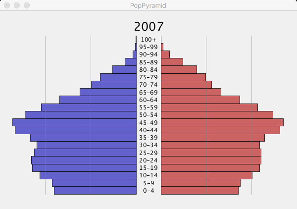
A population pyramid is a standard way to visualize the age distribution in a population. At its core, it works like two bar graphs turned sideways. You divide a population up into age groups and show the number of people belonging to each age group at some point in time. One bar graph (the one on the left in the image above) shows the male population, and the other shows the female population.
Statistics Canada publishes annual age-segmented population data going back to 1971, giving us a clear snapshot of how the Canadian population pyramid has evolved over 45 years. You will write a sketch that uses the StatsCan data to render population pyramids, with the ability to move interactively through the years and watch the changes. You'll be able to witness large-scale trends at a glance. For example, the bars getting longer overall indicates an increase in the total population. The bulges in the charts generally move up over time, showing the population aging.
Here is a suggested sequence of steps to complete the assignment:
Download the starter code and unzip it. In the A09 folder, open the sketch titled PopPyramid.
Read through the starter code carefully—there's a fair amount there already. You'll see a number of useful global variables that control the rendering of bar graphs. They tell you how many age "slices" (i.e., bars in the charts) you'll need to deal with, the largest population that will be represented in any bar, and constants for the widths and heights of the bars relative to the sketch window. Note also the FloatDict used to map the "names" of age ranges as they appear in the government's CSV data to useful y locations.
In draw(), add code that writes the current year at the top of the sketch window, as shown above. The built-in functions textSize() and textAlign() will undoubtedly be useful here. Alternatively, you're free to experiment with different layouts of the bar charts and labels in the sketch, as long as all the same information is present and the layout is reasonable.
In draw(), add code that writes the labels for the age ranges in the space between the bar graphs. Ideally, draw the labels using a loop. Note that if you're using a counter like idx to iterate over the bars from bottom to top, then the idxth age range runs from ages 5*idx to 5*idx+4. You may need to shift the y positions of these labels slightly so that they appear vertically centred relative to the corresponding bars.
Now add code to draw just the chart for the female population in the current year. You can do this by iterating over the rows of the table exactly once. For each row, verify that the GEO field contains "Canada" (and not one of the provinces or terrorities), that the year is the current year, and that the sex is "Females". If any of these is not true, don't do anything else for this table row—it's not relevant to the current chart. (Protip: you can use the continue; statement to jump directly to the next iteration of the loop.)
Now get the AGE field for this row and check whether the String you get back appears in the dictionary provided in the sketch. If the field is a key in the dictionary, its corresponding value will tell you the y position for the bar you'll draw. If it's not in the dictionary, skip to the next row.
If you've made it this far, get the population of women in this age range in this year by reading the Value field of the row and plug it into map() to get the width of the bar to draw. Then go ahead and draw a bar!
Add code to draw the chart for the male population in the current year. The approach is very similar to that of the previous step, except that you have to look for "Males" and not "Females" and the bars must grow to the left.
You'll find that there's a lot of potential duplication of code between the female and male charts. By far the most elegant way to deal with this repetition is to abstract it out into a helper function. A possible helper function named drawChart() is provided for you, intended to take "Males" or "Females" as a parameter. If you write this function correctly, then you can simply call it twice from draw(). Put each call inside a geometric context; for the male chart, put a transformation in the context that flips the chart across a vertical line. You are permitted to duplicate the chart-drawing code and not use a helper function like drawChart(), but you will receive at most 90% on the assignment.
Make sure that when the user presses the left and right arrow keys, all information in the sketch window updates appropriately. Holding down an arrow key should cause the chart to "animate" smoothly as populations age and are shuffled upward and downward.
Those are the core requirements for this assignment. You can spice up your sketch however you like. Choose a reasonable colour scheme for the background, the text, and the two sets of bars. Add other annotations or interactivity if you like. The example above adds thin vertical lines to mark population values of 500,000 and 1,000,000, making it easier to judge the bars, but that's not required. There's a lot more data in the table too—different divisions into age ranges (including individual ages) and geographic regions. Consider visualizing these other parts of the dataset. Creative or innovative visualizations will receive bonus marks. If you depart too much from the original specification, consider submitting a basic solution and also submitted an enhanced version titled PopPyramidEnhanced.
Submission
When you are ready to submit, please follow these steps.
If necessary, review the Code Style Guide and use Processing's built-in auto format tool. You do not need to use the precise coding style outlined in the guide, but whatever style you use, your code must be clear, concise, consistent, and commented.
If necessary, review the How To Submit document for a reminder on how to submit to LEARN.
Make sure to include a comment at the top of all source files containing your name and student ID number.
Create a zip file called A09.zip containing the entire A09 folder and all its subfolders.
Upload A09.zip to LEARN. Remember that you can (and should!) submit as many times as you like. That way, if there's a catastrophe, you and the course staff will still have access to a recent version of your code.
If LEARN isn't working, and only if LEARN isn't working, please email your ZIP file to the course account (see the course home page for the address). In this case, you must mail your ZIP file before the deadline. Please use this only for emergencies, not "just in case". Submissions received after the deadline may receive feedback, but their marks will not count.