 What's in a Letter
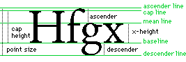
Every serious subject has a language of its own. Typography is no
exception. The following diagram shows a few terms used to talk about
letterforms. Many more appear in the Glossary of Typographic Terms.
These terms let you discuss type like an expert.
Serifs
The serif, or cross-line at the end of a stroke, probably dates from early
Rome. Father Edward Catich proposed in his seminal work, The Origin of the
Serif, that the serif is an artifact of brushing letters onto stone before
cutting them. Serif, or Roman, types are useful in text because the serifs
help distinguish individual letters and provide continuity for the reader's
eye.
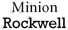
Serifs come in many styles. Compare the tapered serifs of Minion to the
slab serifs of Rockwell:
x-height
Traditionally, x-height is the height of the lowercase letter x. It
affects the feel of a typeface, how many characters fit on a line, and
depending on how the type is set, how easily your text can be read. At
very small point sizes, a font with a larger x-height is easier to read,
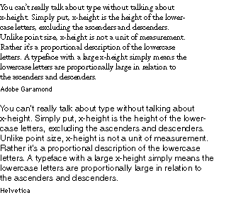
everything else being equal. Compare the following examples of Garamond
and Helvetica, both at a point size of 12:
![Adobe Systems Incorporated [Navigation Bar]](1topbar.gif)

