Spacing
Type is defined by the space around it, whether between letters, words, or
lines.
Fixed-Pitch vs. Proportional
Typewriter fonts are usually fixed pitch. Fixed pitch means that each
character, whether it's an 'i' or 'm', takes up the same amount of space.
A fixed-pitch font, such as Courier, works well with the simple, mechanical
design of a typewriter.
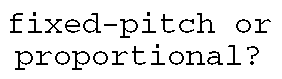
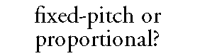
Commercially-printed text and all the modern digital type used on computers
is generally designed to be proportionally spaced. With proportional
spacing, each letter is given just the amount of space it needs to look
right and be most legible. Using a proportional font, you can fit much
more text on a page than using a fixed-pitch font and can improve
readability.
Line Length
As lines of text get long, it can be difficult for the reader to move from
the end of one line to the beginning of the next. On the other hand, short
line lengths break up the text and interrupt the reader. The ideal line
length depends on the design of the typeface, type size, line spacing, and
length of the copy. Generally, a line should have 55 to 60 characters, or
9 to 10 words, for optimal readability.
Leading
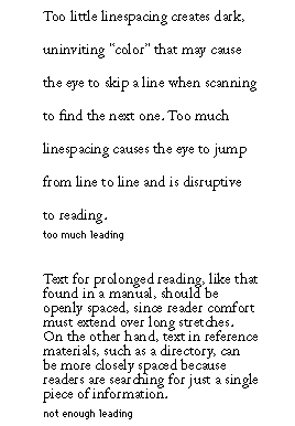
Leading is the distance between lines of type and is measured in points.
During the days of metal type, printers inserted extra strips of lead
between long lines of text to make them easier to read. This procedure
gave rise to the term "leading." Most word processing and page layout
applications let you adjust the leading in your documents. Experiment with
this feature to see how it affects legibility.
Word and Letter Spacing
You can also adjust word spacing and letter spacing to improve legibility.
Although typefaces are designed with the correct spacing between characters
for general use, special situations can result in the type's looking
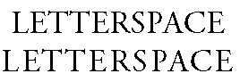
crowded or too loose. For example, words printed in all UPPERCASE tend to
look too tight because the designer assumed that uppercase and lowercase
letters would be mixed. If your application allows you to adjust letter
spacing, you should add a small amount of letter space to words printed in
all uppercase.
Many letter combinations, particularly in words set in capitals, do not
look right together unless they are kerned. Kerning is the adjustment of
space between pairs of letters. Kerning is especially important at large
point sizes. As the characters are enlarged, so is the space between them.
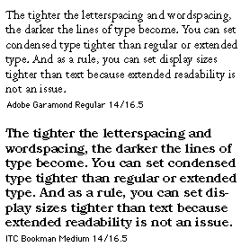
Word spacing, the space between words, should be constant in flush left,
flush right, or centered text. However, for justified text, word spacing
varies from line to line to keep margins even, and it is important to keep
word spacing as consistent as possible, often with the use of hyphenation
to aid readability. Tight word spacing lets you place more text on the
page, but can make it difficult to distinguish words from each other.
Loose word spacing fills up a page with a small amount of text, but becomes
harder to read as the words begin to look disconnected.

Typographic Color
Spacing concerns and the design of the typeface itself affect what is known
as typographic color. This term may seem like a misnomer in an age when
even word processors let you apply actual color (for example, red, blue or
green) to type as easily as changing the point size. Typographic color is
really the grey value, or density, of a mass of type on the page. A page
may have light or dark color, but you must keep the color consistent on the
page to aid readability.