 Use the Right Character
The difference between an amateur document and a professional one can be a
matter of details. The following topics cover some of the most commonly
overlooked or incorrectly handled details of typography.
Italics, Boldface, and Uppercase
Normally you should avoid underlining text. Underlining is left over from
typewriters, which lacked italics. Sometimes underlining is necessary when
no adequate italic is available. Use italics for emphasis or for proper
convention, such as the titles of books, periodicals, and plays.
If you want something to jump out on the page, try using boldface, but
remember, contrast attracts attention. The best-designed pages display a
clear hierarchy of information. If you make everything bold, nothing will
stand out.
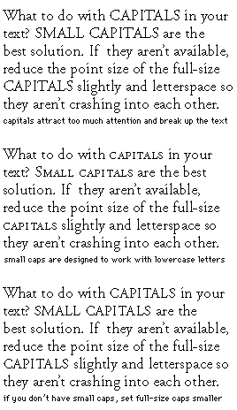
Avoid using all uppercase letters to emphasize text. They aren't as
readable as lowercase letters and interrupt the flow of the text. When
your document calls for all capitals, use one of the small capital
typefaces available from Adobe.
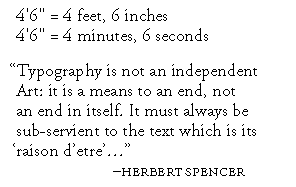
Getting Your Quotes Right
The neutral quote marks (' and ") that are accessible from your keyboard
are traditionally used to indicate units of measure. True, or directional,
quotes (sometimes called curly quotes) should be used whenever possible.
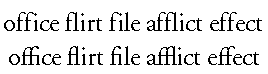
Using the Experts
Adobe sells a number of Expert-set typeface collections. These collections
contain many of the less frequently used characters that add a professional
look to your documents, including old style figures, small caps, ornaments,
and ligatures. For example, you can use f-ligatures, which eliminate
awkward character combinations. Compare the ff, fi, fl, ffi, and ffl
ligature combinations in the second line with the individual characters in
the first line.
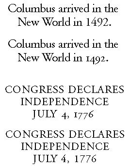
Upper- and Lowercase Numbers
When you are setting numbers with lowercase text, it is best to use
lowercase numbers. That's right! Numbers come in upper- and lowercase
versions.
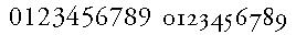
The lowercase versions are often called old style figures, and they
contain characters with ascenders and descenders. Uppercase numbers look
fine in spreadsheets and in uppercase text, but look too large in body
text.
Small Capitals
Smaller versions of regular capital letters, called small capitals, are
designed to be visually appealing with lowercase characters in a typeface,
that is, they are drawn to have the same typographic color as the
lowercase.
Some applications allow you to apply a small-capitals style to your text.
This usually means that the application reduces the point size of full caps
to about the height of the lowercase. The resulting letters are usually
too light, even if the application does something fancy like horizontally
expanding the type at the same time.
Small capitals are useful for section headings or chapter titles, to accent
important words or phrases in mid-sentence, or at the beginning of a
paragraph for a lead-in. True small caps are one sign of a truly
professional job.