 Tips and Stuff
Bullets
A single, consistently used graphic element can add flavor to your document
and highlight key points. Instead of the standard bullet, look through
the Symbol faces in the Classifications view for an ornament that matches
your message. If your document is clean and simple and you have only a few
bullet points, an ornament will add interest. Be careful not to clutter
your document.

Hanging Indents
- When a bulleted or numbered list contains items that run to more than one
line, it is common to "hang" the text from a bullet or number. A paragraph
may also be hung from the first line of text (often with a run-in head of
bold or italic) when no bullet or number is present. In either case, the
hanging indent more clearly marks the item in the list.
- When a bulleted or numbered list contains items that run to more than
one line, it is common to "hang" the text from the bullet or number. A
paragraph may also be hung from the first line of text -- often with a run-in
head of bold or italic -- when no bullet or number is present. In either
case, the hanging indent more clearly marks the item in the list.
- When a bulleted or numbered list
- contains items that run to more than one
line, it is common to hang the text from the bullet or number. A paragraph
may also be hung from the first line of text (often with a run-in head of
bold or italic) when no bullet or number is present. In either case, the
hanging indent more clearly marks the item in the list.
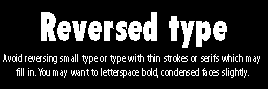
Reversed Text
Use white text on a black background sparingly, and never at small sizes.
Using Styles
Styles are paragraph descriptors that specify, for example, what font to
use and how much to indent. If your desktop publishing application
supports styles, you can build a set to give all your documents a
consistent look.
Also, when styles are applied to your documents, you can easily change the
entire look of a document just by changing the style definitions.
Keeping It Simple
Good document design is mainly a combination of common sense and keeping
things simple. Look at attractive examples of documents that are similar
to what you're trying to create. The following list explains some basic
DOs and DON'Ts.
- Long lines of text are hard to read. Generally, a line should have 55 to
60 characters, or 9 to 10 words. Try multiple columns or, if you are stuck
with a long line length, increase the leading slightly to make it easier
for the eye to move from line to line.
- White space on the page makes your document cleaner and easier to read.
- Use indents and bullets to highlight important points. Use headings and
subheadings to help your readers find the information they're interested
in.
- Avoid using more than two type families on a page. Generally one serif and
one sans serif make a nice mix. Using the sans serif for headlines and the
serif for body text is a common and familiar formula.
- Use italics and bold to highlight words and phrases, rather than using all
uppercase. All uppercase is hard to read.
- Left justification can be easier to read and looks less formal than full
justification. Pick the one that matches the tone of your document.
- Graphs, pictures, and charts add interest to your documents and clarify
your text. Horizontal and vertical lines can be used sparingly to break up
blocks of text.