User interfaces
Graphical applications aren’t restricted to desktop computing; graphical user interfaces exist on all modern computing devices, from smartwatches, to phones and tablets, to car entertainment systems.
Mobile and desktop toolkits solve similar problems for their respective platforms, while also addressing the unique challenges of each one (e.g. touch input is a major smartphone-specific feature, but almost irrelevant for desktop environments).
User Interface Toolkits
What is a UI toolkit?
A widget or UI toolkit is a framework that provides support for building applications. Essentially, toolkits provide an abstraction of underlying operating system functionality, with a focus on application features. e.g. graphics, sound, reusable widgets and events.
Common features include:
- Creating and managing application windows, with standard window functionality e.g. overlapping windows, depth, min/max buttons, resizing. This is more important on desktop than mobile, although mobile toolkits are expanding to include mobile-specific windowing functionality.
- Graphical output, including 2D graphics, animations, sound and other methods of communicating information to the user.
- Providing reusable components called widgets that can be used to assemble a typical applications. e.g. buttons, lists, toolbars, images, text views. Promoting common components ensures that applications on that platform have common interaction mechanisms i.e. that they “look and feel similar”, which is beneficial for users.
- Support for an event-driven architecture, where events (messages) can be published and circulated through your application. This is the primary mechanism that we use to intercept and handle user input, or other system messages e.g., indicating that your phone has changed orientation, or that a window has closed.
There are a large number of toolkits available! Deciding on a toolkit is often a matter of finding one that supports your target platform and preferred programming language. Popular toolkits include WTL (Windows, C++), Cocoa (macOS, C++) and GTK (multi-platform but common on Linux, using C).
There are also cross-platform toolkits, designed to work across different platforms. Examples include JavaFX and Swing for Java, Flutter, or Jetpack Compose, which we’ll be using in this course.
Toolkit Design
When building applications with toolkits and widgets, a developer needs to write code to control the appearance and position of these widgets, as well as code to handle user input. A lot of the complexity with this model is ensuring that application state is managed properly across UI components, business-objects, and models (e.g. if a user updates something on-screen, you need to make sure that the data is updated everywhere in your application, including possibly other windows that show that data).
This is how imperative toolkits like JavaFX and Qt work. The developer has to write the “glue code” that tells the system how to update the user interface in response to state changes, either from the user interacting with on-screen widgets, or from external events received by the application. This is the source of a lot of complexity in user interface development, and a frequent cause of errors.
By contrast, a declarative toolkit automatically manages how the UI reacts to state changes. The developer focuses on describing what state is required, and how state is used to initialize on-screen components, but doesn’t need to write any glue-code. As state changes occur in your application, the UI is automatically changed to reflect that state. This technique works by conceptually regenerating the entire screen from scratch, and then applying any changes that are required to reflect state. The result is a simpler conceptual model for developers.
Windowing systems
A window is simply a region of the screen that “belongs” to a specific application. Typically one application has one main window, but it may also own and control additional windows. These are overlayed on a “desktop”, which is really just the screen background.
To manage different windows across many different applications, a part of the operating system called a windowing system is responsible for creating, destroying and managing running windows. The windowing system provides an API to applications to support for all window-related functionality, including:
- provide an mechanism for applications to create, or destroy their own windows
- handle window movement automatically and invisibly to the application (i.e. when you drag a window, the windowing system moves it).
- handles overlapping windows across applications (e.g. so that your application window can be brought to the ““front” and overlap another application’s window).
Typically, the toolkit will provide an API that allows the developer to pass through requests to the windowing system to create and manage windows. Often, this includes window methods properties that can be manipulated to control window behaviour.
- Sample class:
Stage,Window. - Sample properties:
minWidth,prefWidth,maxWidth;minHeight,prefHeight,maxHeight;title;isFullScreen;isResizable - Sample methods:
close(),toFront(),toBack()
Graphical Output
Graphical output is a broad category that includes drawing and positioning elements on-screen. This can include adding arbitrary elements (e.g. circles, rectangles or other primitives), structured data (e.g. PNG or JPG images, MP4 video) or reusable widgets to the window.
We’ll briefly cover standard concepts before discussing specifics of any of these.
Coordinate systems
A computer screen uses a Cartesean coordinate system to track window position. By convention, the top-left is the origin, with x increasing as you move right, and y increasing as you move down the screen. The bottom-right corner of the screen is maximum x and y, which equals the resolution of the screen1.
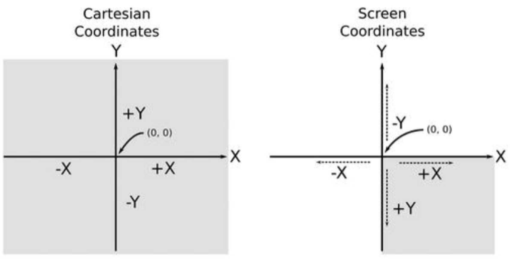
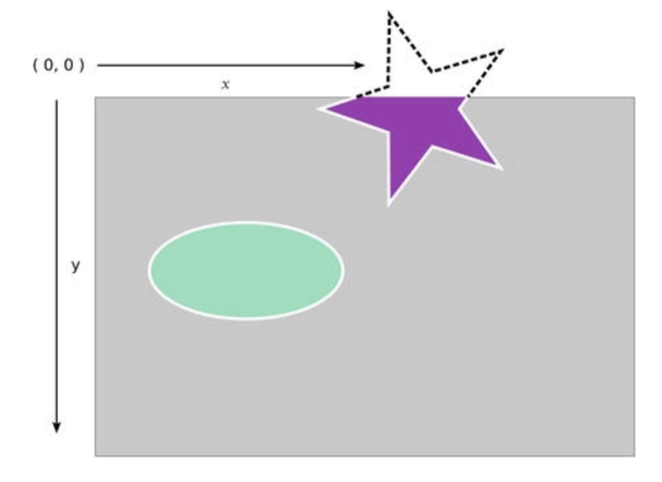
Note that its possible for screen contents to move moved out-of-bounds and made inaccessible. We typically don’t want to do this.
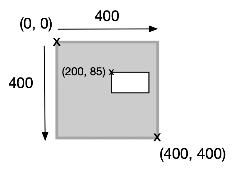
In the example below, you can see that this is a 1600x1200 resolution screen2, with the four corner positions marked. It contains a single 400x400 window, positioned at (500, 475) using these global coordinates.

Given that the windowing system manages movement and positioning of windows on-screen, an application window doesn’t actually know where it’s located on-screen! The application that “owns” the window above doesn’t have access to it’s global coordinates (i.e. where it resides on the screen). It does however, have access to it’s own internal, or local coordinates. For example, our window might contain other objects, and the application would know about their placement. In this local coordinate system, we use the top of the window as the origin, with the bottom-right coordinate being the (width, height) of the window. Objects within the window are referenced relative to the window’s origin.
Widgets & layout
We’re going to refer to graphical on-screen elements as widgets. Most toolkits support a large number of similar widgets. The diagram below shows one desktop toolkit with drop-down lists, radio buttons, lists and so on. All of these elements are considered widgets.
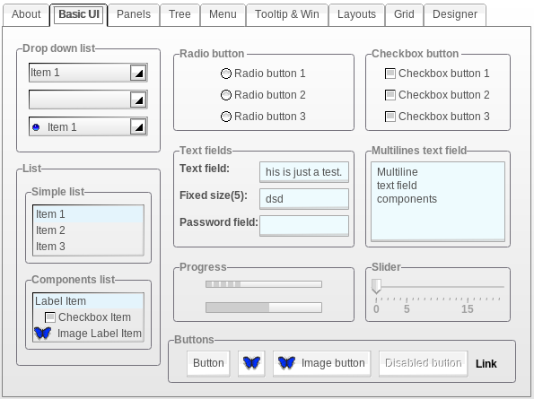
Typically, using widgets us as simple as instantiating them, adding them to the window, and setting up a mechanism to detect when users interact with them so that appropriate actions can be taken.
Scene graph
It’s standard practice in graphical applications to represent the interface as a scene graph. This is a mechanism for modelling a graphical application as a tree of nodes (widgets), where each node has exactly one parent. Effects applied to the parent are applied to all of its children.
Toolkits support scene graphs directly. There is typically a distinction made between Container widgets and Node widgets. Containers are widgets that are meant to hold other widgets e.g. menus which hold menu_items, toolbars which can hold toolbar_buttons and so on. Nodes are widgets that are interactive and don’t have any children.
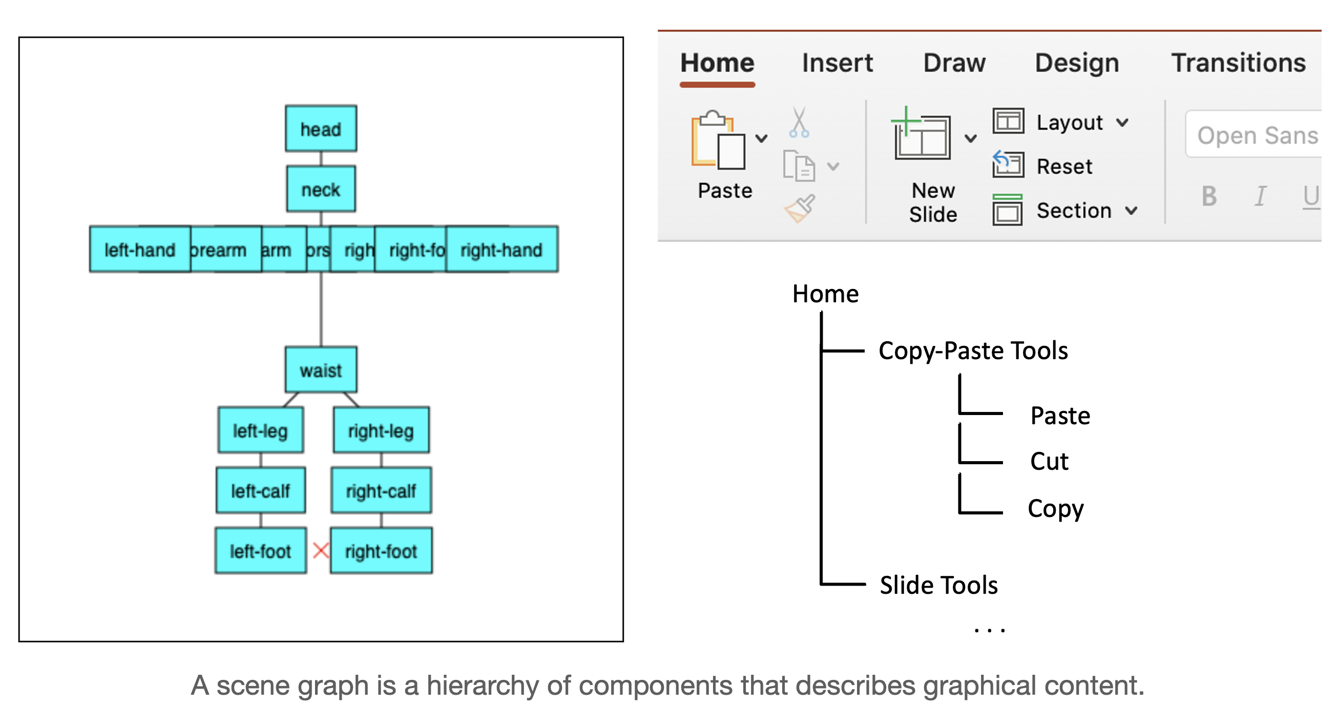
Building a UI involves explicitly setting up the scene graph by instantiating nodes, and adding them to containers to build a scene graph. (For this reason, containers will always have a list of children, and a mechanism for adding and removing children from their list).
Layout
Layout is the mechanism by which nodes in the scene graph are positioned on the screen, and managed if the window is resized.
- Fixed layout is a mechanism to place widgets in a static layout where the window will remain the same size. This is done by setting properties of the widgets to designate each one’s position, and ensuring that the containers do not attempt any dynamic layout.
- Relative layout delegates responsibility for widget position and size to their parents (i.e. containers). Typically this means setting up the scene graph in such a way that the appropriate container is used based on how it adjusts position. Typical containers include a vertical-box that aligns it’s children in a vertical line, or a grid that places children in a grid with fixed rows and columns.
Event management
Applications often handle multiple types of processing: asynchronous, such as when a user types a few keystrokes, or synchronous, such as when we want a computation to run non-stop to completion.
User interfaces are designed around the idea of using events or messages as a mechanism for components to indicate state changes to other interested entities. This works well, due to the asynchronous nature of user-driven interaction, where there can be relatively long delays between inputs (i.e. humans type slowly compared to the rate at which a computer can process the keystrokes).
This type of system, designed around the production, transmission and consumption of events between loosely-coupled components, is called an Event-Driven Architecture. It’s the foundation to most user-interface centric applications (desktop, mobile), which common use messages to signal a user’s interaction with a viewable component in the interface.
What’s an event? An event is any significant occurrence or change in state for system hardware or software.
The source of an event can be from internal or external inputs. Events can generate from a user, like a mouse click or keystroke, an external source, such as a sensor output, or come from the system, like loading a program.
How does event-driven architecture work? Event-driven architecture is made up of event producers and event consumers. An event producer detects or senses the conditions that indicate that something has happened, and creates an event.
The event is transmitted from the event producer to the event consumers through event channels, where an event processing platform processes the event asynchronously. Event consumers need to be informed when an event has occurred, and can choose to act on it.
Events be generated from user actions, like a mouse click or keystroke, an external source, such as a sensor output, or come from the system, like loading a program.
An event driven system typically runs an event loop, that keeps waiting for these events. The process is illustrated in the diagram below:
- An EventEmitter generates an event.
- The event is placed in an event queue.
- An event loop peels off events from the queue and dispatches them to event handlers (functions which have been registered to receive this specific type of event).
- The event handlers receive and process the event.
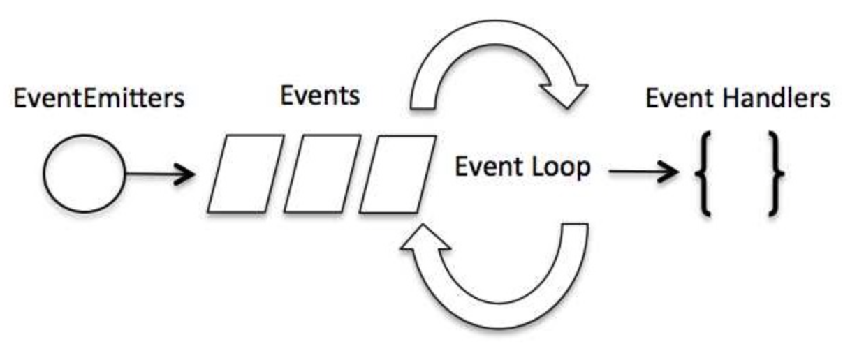
Event handlers are usually implemented as anonymous functions (lambdas) that represent the action we want to take in response to an event being generated. e.g., in the code below, we assign a lambda function to the onClick handler for this particular Button. When the button is pressed (aka “clicked”), the code fires.
All interactive composables have handlers like this. We’ll discuss this further in the coming sections.
Button(
    modifier = modifier.padding(2.dp),
    onClick = {
        Toast.makeText(activity, "This is a short popup!", Toast.LENGTH_SHORT).show()
    }
) {
    Text("Short Toast")
}
Compose framework
JetPack Compose is a modern user-interface framework. Kotlin, Gradle, and Jetpack Compose together represent Google’s preferred toolchain for Android development.
JetBrains recently ported Jetpack Compose to desktop, and released it as Compose Multiplatform, which contains the complete port augmented with specific desktop composables (e.g., a window doesn’t exist on Android, but does exist on desktop).
The long-term vision of Kotlin and its ecosystem is to support code-sharing across all relevant platforms, at each layer of your application. This requires multiplatform support at each architectural layer, including multiplatform database libraries, networking libraries, user interface libraries, etc. A common GUI toolkit is a major step towards cross-platform development.

Compose Multiplatform Architecture (Droidcon 2023)
Compose is a declarative framework. As compared to traditional imperative toolkits, a declarative framework has two specific differences:
- It focuses on what you want to display on-screen, instead of how it should be created and managed. Imperative toolkits often expect the developer to use declarative syntax to describe the UI structure (e.g. Android and XML files), and then write the underlying glue-code to make that UI interactive. Declarative environments simplify this structure, so that UIs are defined completely in code. Declarative code is shorter and often simpler and easier to read.
- State-flow is handled differently. The framework itself manages state, and determines when and how to update and re-render components on-screen. This greatly simplifies the work that the developer has to do, and avoids a lot of the accidental complexity that creeps into large UIs.
A declarative structure is much simpler to read and maintain. Other modern toolkits like Swift UI and React are built around similar concepts, and have been extremely successful with this paradigm.
Compose is also cross-platform, so you can share code across platforms. This makes it easier to write a single application that can run on Android, iOS, desktop and even targets like WASM. Compose minimizes the amount of custom code that you need to write for each platform.
Finally, Compose is designed to be extremely fast. Under-the-covers, it uses skia, a high-performance Open Source graphics library, to draw on a native canvas on each target platform (the same library used by the Chrome browser). This enables it to achieve consistently high performance across all platforms, and makes it much “snappier” than early toolkits that relied on software renderers.
Composable functions
A key concept in Compose is the idea of a composable function, which is a particular kind of function that describes a small portion of your UI. You build your entire interface by defining a set of composable functions that take in data and emit UI elements.
Here’s an example of a simple composable function (aka composable) that takes in a String and displays it on-screen:
@Composable
fun Greeting(name: String) {
  Text("Hello $name!")
}
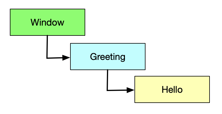
Here is the corresponding scene graph for this composable function:
Here are some characteristics of a composable:
- The function is annotated with the
@Composableannotation. All Composable functions that we write must have this annotation. - Composable functions will often accept parameters, which are used to format the composable before displaying it.
- This function actually creates and displays the Text composable. We say that composables
emitUI. - The function doesn’t return anything. Compose functions that emit UI do not need to return anything, because they describe the desired screen state directly.
- This function is fast, idempotent, and free of side effects.
Composable scope
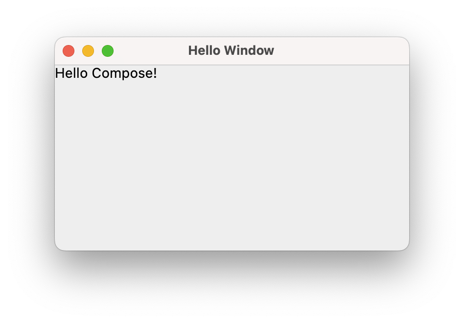
Let’s use this code snippet to display some text in an application window.
fun main() = application {
    Window(
      title = "Hello Window",
      onCloseRequest = ::exitApplication
    ) {
      Greeting("Compose")
    }
}

@Composable
fun Greeting(name: String) {
  Text("Hello $name!")
}
In this snippet, the application function defines a Composable Scope (think of a scope as the context in which our application runs). Within that scope, we use a Window composable to emit a window. We pass it two parameters:
- a title string that will be set for the window, and
- a lambda function that will be executed when an
onCloseRequestevent is received (i.e. when the window closes, we execute the build-inexitApplicationfunction).
In this case, the Window composable calls our Greeting composable, which emits the Text composable, which in turn displays our text.
When Jetpack Compose runs your composables for the first time, during initial composition, it will keep track of the composables that you call to describe your UI in a Composition. Then, when the state of your app changes, Jetpack Compose schedules a recomposition.
Recomposition is when Jetpack Compose re-executes the composables that may have changed in response to state changes, and then updates the Composition to reflect any changes. A Composition can only be produced by an initial composition and updated by recomposition. The only way to modify a Composition is through recomposition.
See Lifecycle Overview for more details.
Let’s try and add some interactivity to this application. We’ll display our initial string on a button. When the user presses the button, it will change the value being displayed.
Our Button is yet-another composable. It requires us to set a parameter named onClick, which is assigned to the function (or lambda) that will be called when the button is clicked (for those familiar with other toolkits, we’re assigning the onClick event handler for that button).
Let’s start by just confirming that we can print something to the console when the button is pressed.
fun main() = application {
    Window(
        title = "Hello Window",
        onCloseRequest = ::exitApplication
    ) {
        Greeting("Unpressed")
    }
}

@Composable
fun Greeting(name: String) {
    Button(onClick = { println("Button pressed") }) {
        Text("Hello $name")
    }
}
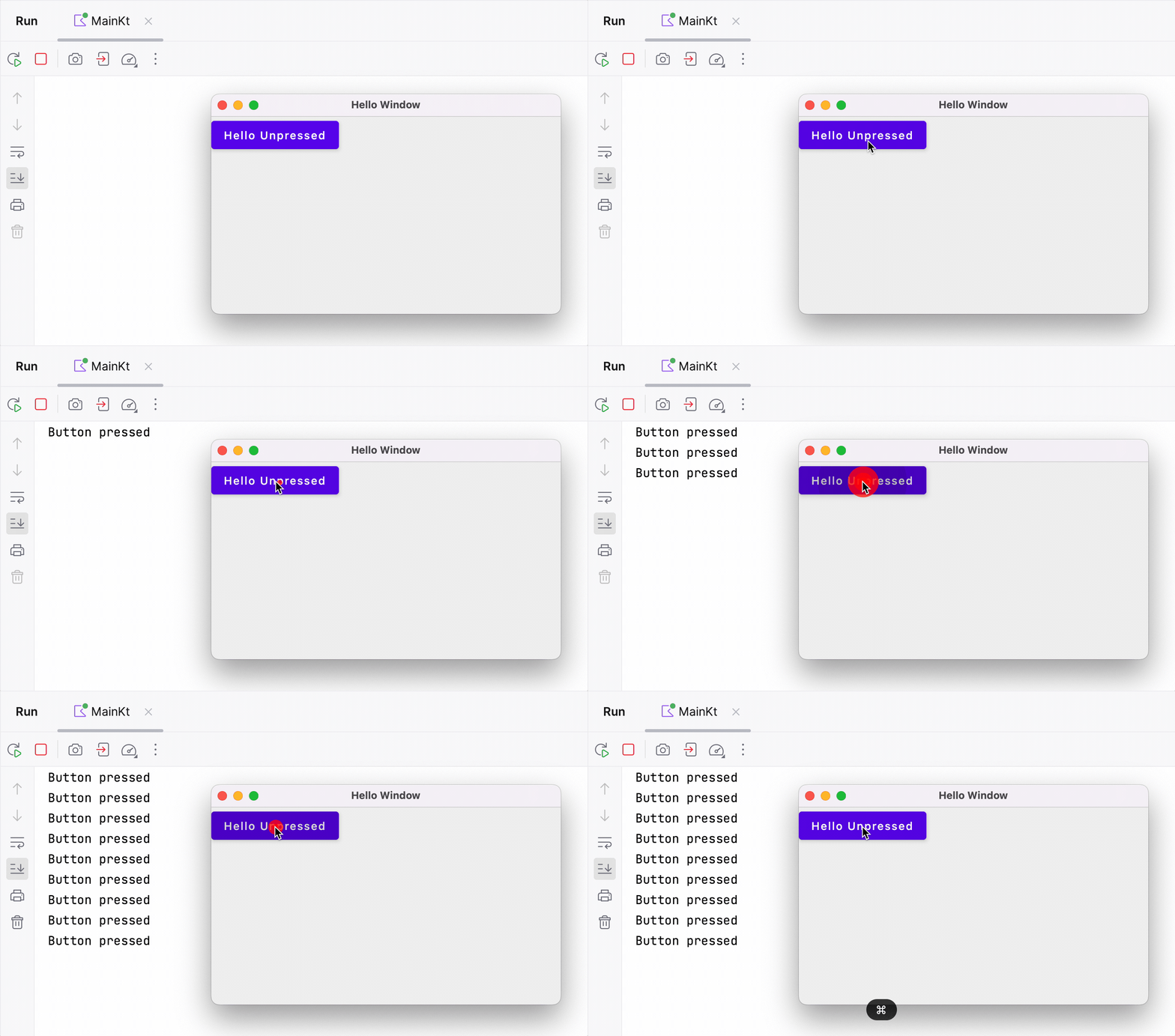
So far it works as we’d hoped! The button displays the string passed in, and our event handler prints to the console when the button is pressed. Let’s try and change our event handler so that we instead change the text on the button when it’s pressed.
It’s a little tricky because we cannot update the parameter directly, so we create a variable currentName to store our display value and then update that in the handler.
fun main() = application {
    Window(
        title = "Hello Window",
        onCloseRequest = ::exitApplication
    ) {
        Greeting("Unpressed")
    }
}

@Composable
fun Greeting(name: String) {
    var currentName = name
    Button(onClick = { currentName = "Pressed" }) {
        Text("Hello $currentName")
    }
}
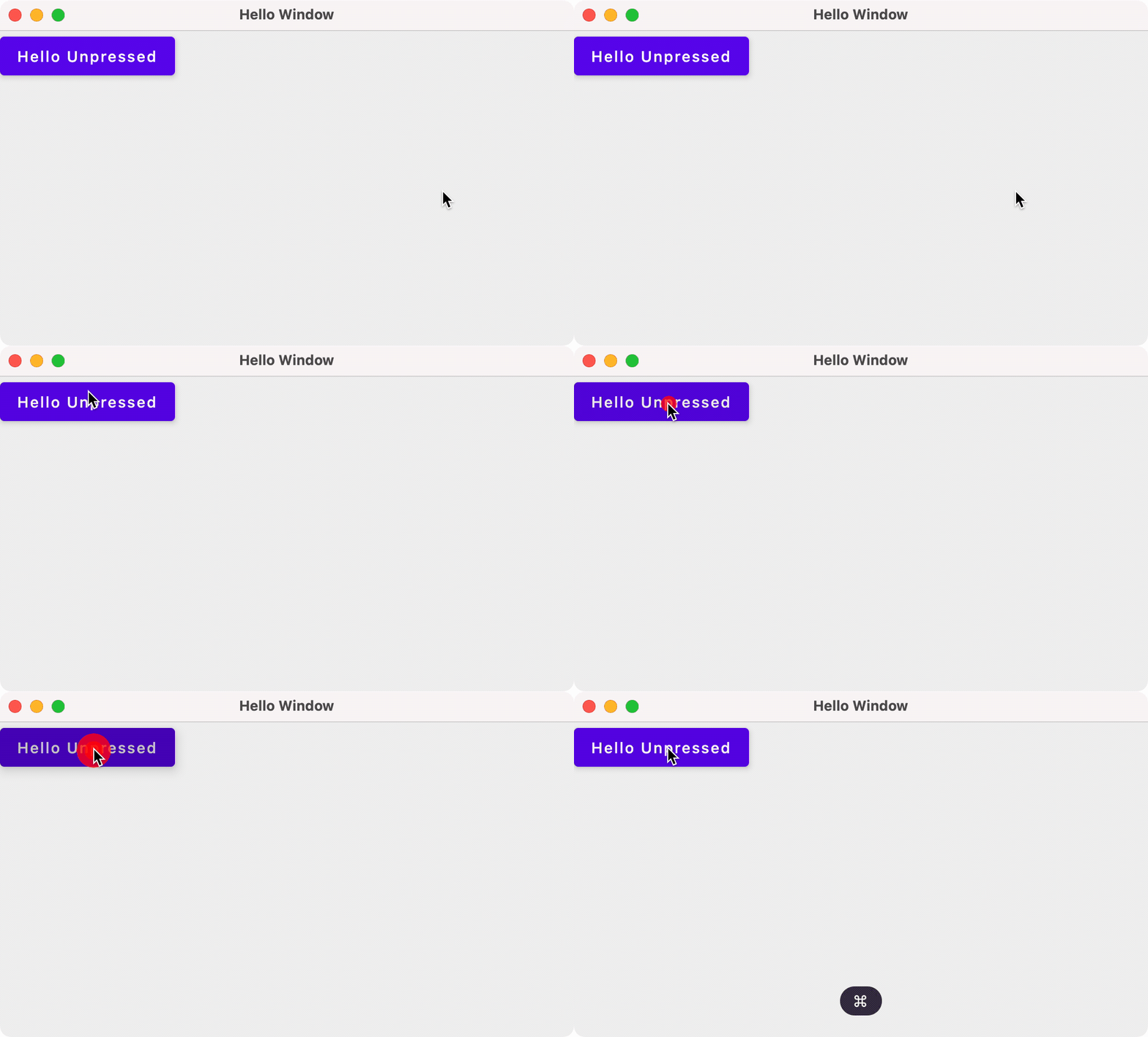
Nothing changed? Why didn’t that work?! It has to do with how Compose manages and reflects state changes.
Recomposition
The declarative design of Compose means that it draws the screen when the application launches, and then only redraws elements when their state changes. Compose is effectively doing this:
- Drawing the initial user interface.
- Monitoring your state (aka variables) directly.
- When a change is detected in state, the portion of the UI that relies on that state is updated.
Compose redraws affected components by calling their Composable functions. This process - detecting a change, and then redrawing the UI - is called recomposition and is the main design principle behind Compose.
Why doesn’t our example work? In our example above, the onClick handler attempts to change the text property of the Button. This triggers Compose to call the Window composable, which calls the Button composable, which initializes text to it’s initial value… Not what we intended.
We have 2 fundamental challenges to address:
- Storing state such that it is observable by Compose.
- Making sure that we persist state between calls to a Composable function, so that we’re not just re-initializing it each time.
Managing state
To make the state observable, we store it in instances of a MutableState class that Compose can directly monitor. In our example, we’ll use the mutableStateOf wrapper function to do this:
fun main() = application {
    Window(
        title = "Hello Window",
        onCloseRequest = ::exitApplication
    ) {
        Greeting("Unpressed")
    }
}

@Composable
fun Greeting(name: String) {
    var currentName = remember { mutableStateOf(name) }
    Button(onClick = { currentName.value = "Pressed" }) {
        Text("Hello ${currentName.value}")
    }
}
It works! Compose detects when we have clicked on the Button(onClick), updates the text state (currentName.value), and then recomposes the Window and its children based on this new state.
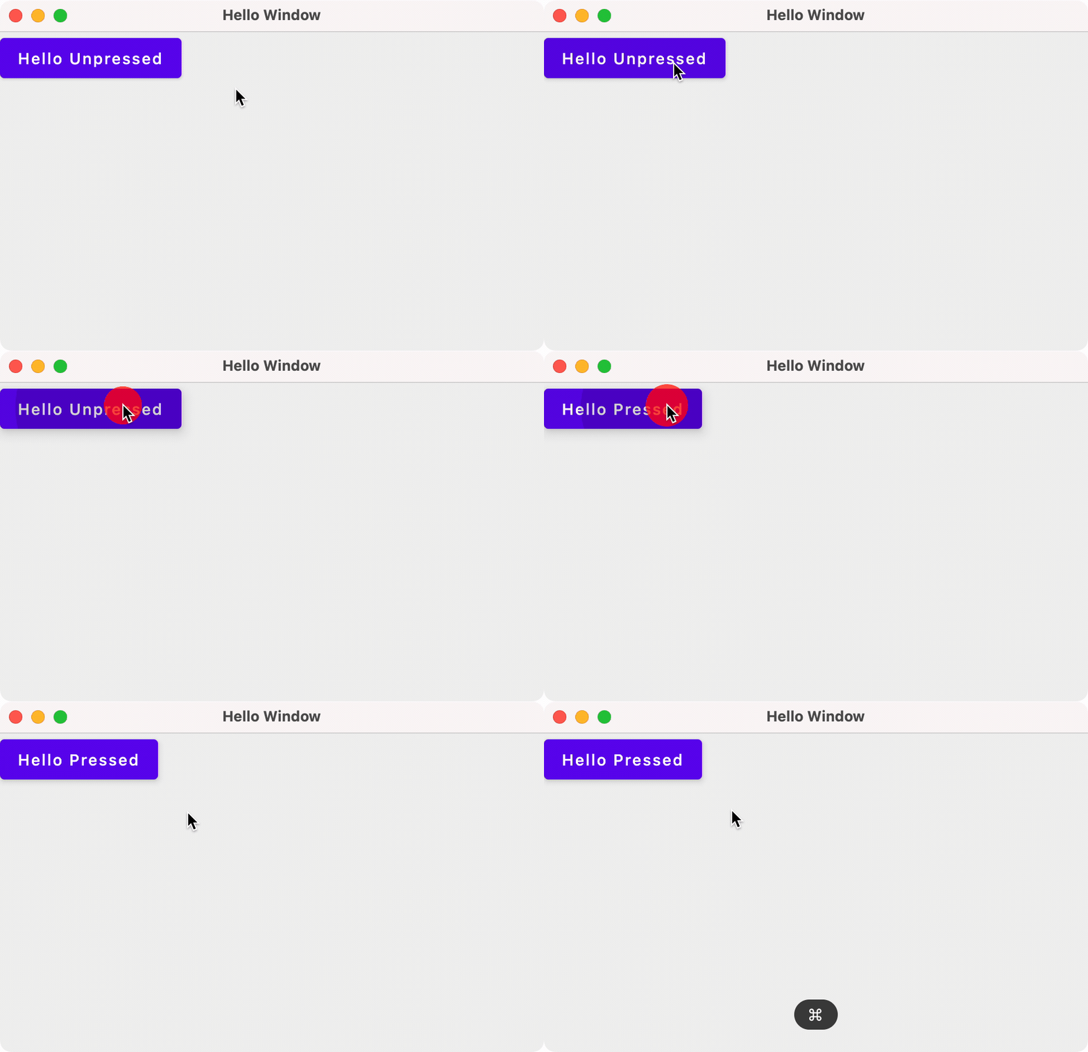
Note that since we changed the type of text from a String to a MutableState<String>, we had to change all variable references to text.value to retrieve the actual value from the state (since it is a class with more properties than just it’s state value).
We also added the remember { } keyword to ensure that the function remembers the state values from the last time it executed. This prevents the function from reinitializing state when it recomposes.
There are multiple classes to handle different types of State. Here’s a partial list—see the Compose documentation for an exhaustive list.
| Class | Helper Function | State that it represents |
|---|---|---|
| MutableState<T> | mutableStateOf() | Primitive <T> |
| MutableList<T> | mutableListOf | List<T> |
| MutableMap<K, V> | mutableMapOf(K, V) | Map<K, V> |
| WindowState | rememberWindowState() | Window parameters e.g. size, position |
| DialogState | rememberDialogState | Similar to WindowState |
We can use these other types of state in appropriate places in our code. For instance, we can add WindowState to the Window and use that to set the window size and position.
fun main() = application {
    Window(
        title = "Hello Window",
        onCloseRequest = ::exitApplication,
        state = WindowState(width=300.dp, height=200.dp, position = WindowPosition(50.dp, 50.dp))
    ) {
        val text = remember { mutableStateOf("Press me") }
        Button(onClick = {text.value = "Pressed!"}) {
            Text(text.value)
        }
    }
}
This is a much more reasonable size!
State hoisting
A composable that uses remember is storing the internal state within that composable, making it stateful (e.g. our Greeting composable function above).
However, storing state in a function can make it difficult to test and reuse. It’s sometimes helpful to pull state out of a function into a higher-level, calling function. This process is called state hoisting.
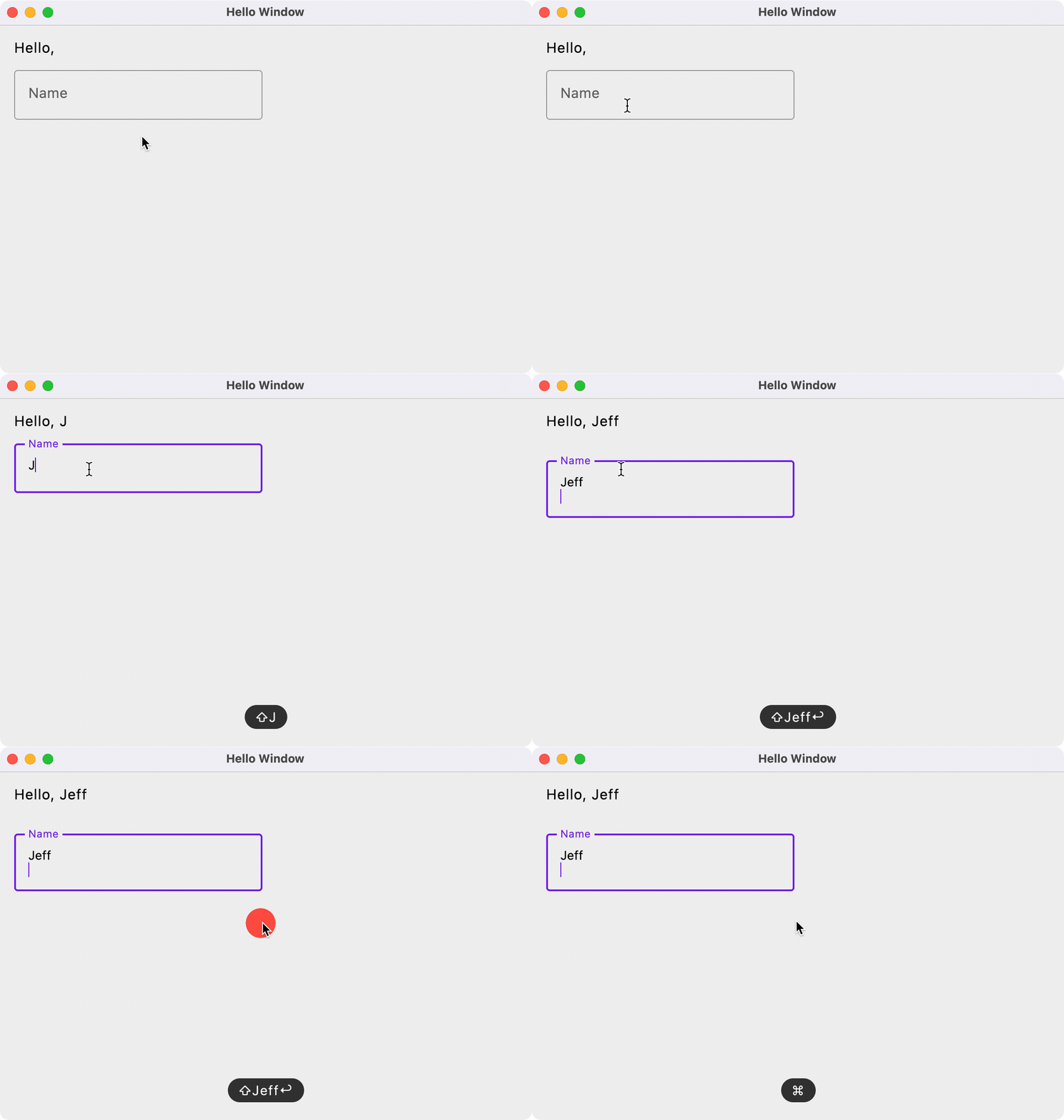
Here’s an example from the JetPack Compose documentation. In the example below, our state is the name that the user is typing in the OutlinedTextField. Instead of storing that in our HelloContent composable, we keep our state variable in the calling class HelloScreen and pass in the callback function that will set that value. This allows us to reuse HelloContent by calling it from other composable functions, and keeping the state in the calling function in each case.
fun main() = application {
    Window(
      title = "Hello Window",
      onCloseRequest = ::exitApplication
    ) {
        HelloScreen()
    }
}

@Composable
fun HelloScreen() {
    var name by remember { mutableStateOf("") }

    HelloContent(name = name, onNameChange = { name = it })
}

@Composable
fun HelloContent(name: String, onNameChange: (String) -> Unit) {
    Column(modifier = Modifier.padding(16.dp)) {
        Text(
            text = "Hello, $name",
            modifier = Modifier.padding(bottom = 8.dp),
            style = MaterialTheme.typography.body1
        )
        OutlinedTextField(value = name, onValueChange = onNameChange, label = { Text("Name") })
    }
}
Layout
Let’s discuss using various @Composables that we can use to build our user interface!
For a detailed guide on layouts, refer to Compose Layouts.
There are three basic Composables that we can use to structure our UIs:
- Column, used to arrange widget elements vertically
- Row, used to arrange widget elements horizontally
- Box, used to arrange objects in layers
Column
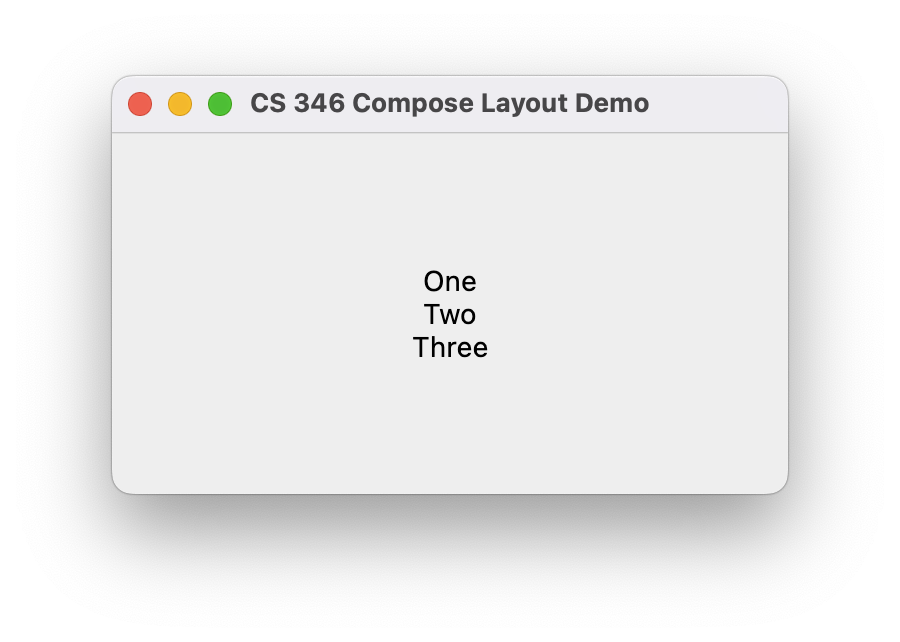
A column is a vertical arrangement of composables.
fun main() = application {
    Window(
      title = "CS 346 Compose Layout Demo",
      onCloseRequest = ::exitApplication
    ) {
        SimpleColumn()
    }
}

@Composable
fun SimpleColumn() {
    Column(
        modifier = Modifier.fillMaxSize(),
        verticalArrangement = Arrangement.Center,
        horizontalAlignment = Alignment.CenterHorizontally
    ) {
        Text("One")
        Text("Two")
        Text("Three")
    }
}
Row
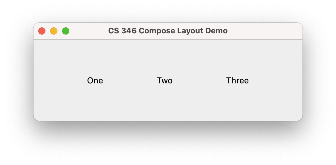
A row is a horizontal arrangement of composables.
fun main() = application {
    Window(
      title = "CS 346 Compose Layout Demo",
      onCloseRequest = ::exitApplication
    ) {
        SimpleRow()
    }
}

@Composable
fun SimpleRow() {
    Row(
        modifier = Modifier.fillMaxSize(),
        verticalAlignment = Alignment.CenterVertically,
        horizontalArrangement = Arrangement.SpaceEvenly
    ) {
        Text("One")
        Text("Two")
        Text("Three")
    }
}
Box
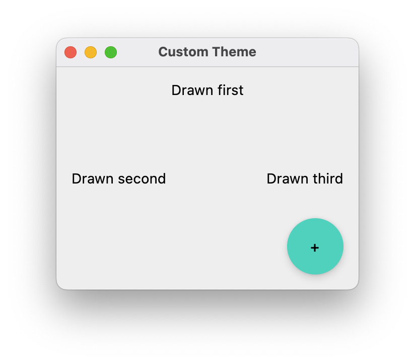
A box is just a rectangular region. Use the composable alignment properties to place each of a Box’s children within its boundaries.
fun main() = application {
    Window(
        title = "Custom Theme",
        onCloseRequest = ::exitApplication,
        state = WindowState(width = 300.dp, height = 250.dp, position = WindowPosition(50.dp, 50.dp))
    ) {
        SimpleBox()
    }
}

@Composable
fun SimpleBox() {
    Box(Modifier.fillMaxSize().padding(15.dp)) {
        Text("Drawn first", modifier = Modifier.align(Alignment.TopCenter))
        Text("Drawn second", modifier = Modifier.align(Alignment.CenterStart))
        Text("Drawn third", modifier = Modifier.align(Alignment.CenterEnd))
        FloatingActionButton(
            modifier = Modifier.align(Alignment.BottomEnd),
            onClick = {println("+ pressed")}
        ) {
            Text("+")
        }
    }
}
We often nest these layout composables together:
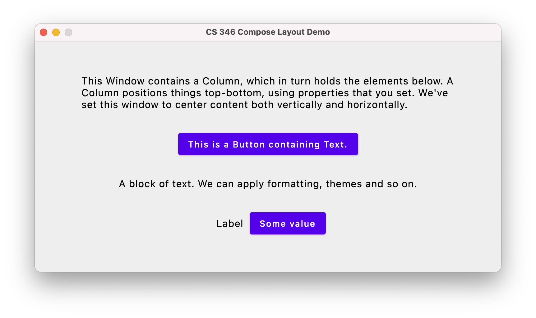
Here’s the code that builds this screen. It contains a Column as the top-level composable, and a Row at the bottom that contains Text and Button composables (which is how we have the layout flowing both top-bottom and left-right).
@Composable
fun CombinedDemo(modifier:Modifier = Modifier) {
    Column(
        modifier = modifier.fillMaxSize().padding(16.dp),
        verticalArrangement = Arrangement.Center,
        horizontalAlignment = Alignment.CenterHorizontally
    ) {
        Text(
            text = "This Window contains a Column, which in turn holds the elements below. A Column positions things top-bottom, using properties that you set. We've set this window to center content both vertically and horizontally.",
            style = MaterialTheme.typography.body1,
            modifier = modifier.width(600.dp)
        )
        Button(
            modifier = modifier,
            onClick =  { println("Button clicked.") }
        ) {
            Text(text = "This is a Button containing Text.")
        }
        Text(
            text = "A block of text. We can apply formatting, themes and so on.",
            style = MaterialTheme.typography.body1,
            modifier = modifier
        )
        Row() {
            Text(
                text = "Label",
                style = MaterialTheme.typography.body1,
                modifier = modifier.align(alignment = Alignment.CenterVertically).padding(10.dp)
            )

            Button(
                modifier = modifier,
                onClick = { println("A different button clicked.") }
            ) {
                Text("Some value")
            }
        }
    }
Lazy Layouts
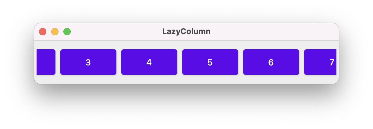
Columns and rows work fine for a small amount of data that fits on the screen. What do you do if you have large lists that might be longer or wider than the space that you have available? Ideally, we would like that content to be presented in a fixed region of the screen, and be scrollable - so that you can move up and down through the list. For performance reasons, we also want large amounts of data to be lazy loaded: only the data that is being displayed needs to be in-memory and other data is loaded only when it needs to be displayed.
Compose has a series of lazy components that work like this:
- LazyColumn
- LazyRow
- LazyVerticalGrid
- LazyHorizontalGrid
Here’s an example of using a LazyRow to present contents that are spread out horizontally, and will lazy-load.
fun main() = application {
    Window(
        title = "LazyColumn",
        state = WindowState(width = 500.dp, height = 100.dp),
        onCloseRequest = ::exitApplication
    ) {
        LazyRowDemo()
    }
}

@Composable
fun LazyRowDemo(modifier: Modifier = Modifier) {
    LazyRow(
        modifier = modifier.padding(4.dp).fillMaxSize(),
        verticalAlignment = Alignment.CenterVertically
    ) {
        items(45) {
            Button(
                onClick = { },
                modifier = Modifier
                    .size(100.dp, 50.dp)
                    .padding(4.dp)
            ) {
                Text(it.toString())
            }
        }
    }
}
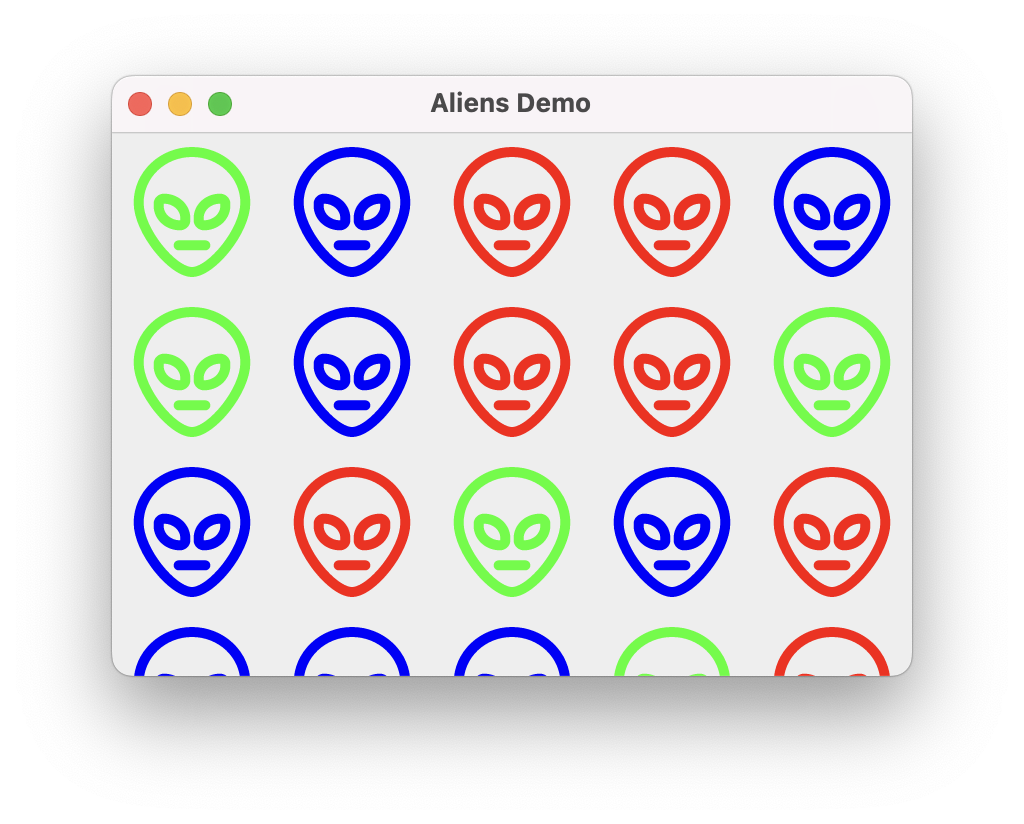
We can do something similar to show a scrollable grid of data:
@Composable
fun AndroidLazyGrid(modifier: Modifier = Modifier) {
    LazyVerticalGrid(modifier = modifier, columns = GridCells.Fixed(5)) {
        val colors = listOf<Color>(Color.Blue, Color.Red, Color.Green)
        items(45) {
            AndroidAlien(color = colors.get(Random.nextInt(0,3)) )
        }
    }
}
Properties
Each class has its own parameters that can be supplied to affect its appearance and behaviour.
Arrangement
Arrangement specifies how elements are laid out by the class. e.g. Row has a horizontalArrangement since it lays elements out horizontally; Column has a verticalArrangement to control vertical layout. Arrangement must be one of these values:
- Arrangement.SpaceEvenly: Place children such that they are spaced evenly across the main axis,
- Arrangement.SpaceBetween: Place children such that they are spaced evenly across the main axis, without free space before the first child or after the last child.
- Arrangement.SpaceAround: Place children such that they are spaced evenly across the main axis, including free space before the first child and after the last child, but half the amount of space existing otherwise between two consecutive children.
- Arrangement.Center: Place children such that they are as close as possible to the middle of the main axis.
- Arrangement.Top: Place children vertically such that they are as close as possible to the top of the main axis
- Arrangement.Bottom: Place children vertically such that they are as close as possible to the bottom of the main axis
Alignment
Alignment specifies how elements are aligned along the dimension of this container class. e.g. top, bottom, or center. These are orthogonal to arrangement (e.g. a Row lays out elements in a horizontal path/arrangement but aligns elements vertically in that path). Alignment must be one of these values:
- Alignment.CenterHorizontally: Center across the horizontalAlignment (e.g. Column)
- Alignment.CenterVertically: Center across the verticalAlignment (e.g. Row).
Modifier
Modifier is a class that contains parameters that are commonly used across elements. This allows us to set a number of parameters within an instance of Modifier, and pass those options between functions in a hierarchy. This is very helpful when you want to set a value and have it cascade through the scene graph (e.g. set horizontalAlignment = Alignment.CenterHorizontally once and have it propagate).
You can see how this is used in the CombinedDemo below:
- an initial modifier is passed as a parameter to the CombinedDemo composable function. If one is not provided, it uses the default Modifier.
fun CombinedDemo(modifier:Modifier = Modifier)
- the Column composable uses the instance of the Modifier, and appends some new values to it. Column then inherits any values that were already set plus any new values that are initialized. In this case, we add
padding(16)to the column’s instance.modifier = modifier.fillMaxSize().padding(16.dp)
- Further composables that the Column calls can either use the modifier that is passed in (
modifier = modifier) or add additional values (modifier = modifier.width(600.dp))
Composables
There’s a very large number of widgets that you can use in Compose! Because it’s cross-platform, most composables and functions exist across all supported platforms.
The Jetpack Compose reference guide is the best source of information on the Composables that are included in the material theme.
Some of the code snippets below inspired by this article: Widgets in JetPack Compose. Others are taken from the Jetpack Compose Material Components list.
Text
A Text composable displays text.
@Composable
fun SimpleText() {
  Text(
      text = "Widget Demo",
      color = Color.Blue,
      fontSize = 30.sp,
      style = MaterialTheme.typography.h2, maxLines = 1
      )
}

Image
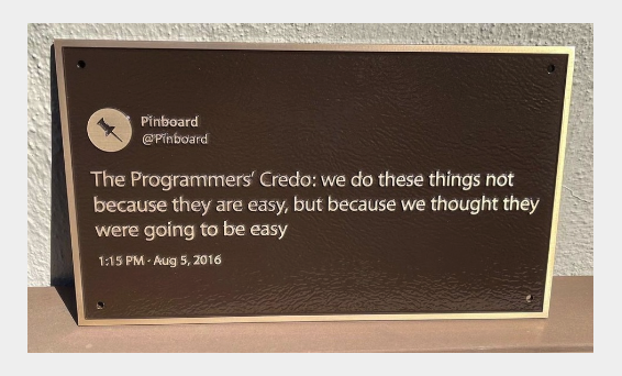
An image composable displays an image (by default, from your Resources folder in your project).
@Composable
fun SimpleImage() {
    Image(
        painter = painterResource("credo.jpg"),
        contentDescription = null,
        contentScale = ContentScale.Fit,
        modifier = Modifier
            .height(150.dp)
            .fillMaxWidth()
            .clip(shape = RoundedCornerShape(10.dp))
    )
}
Button
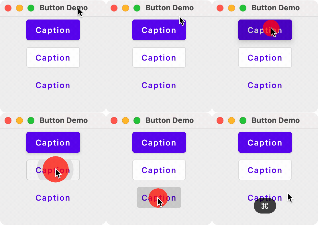
There are three main types of Buttons:
- Button: A standard button with no caption. Used for primary input.
- OutlinedButton: A button with an outline. Intended to be used for secondary input (lesser importance).
- TextButton: A button with a caption.
The onClick function is called when the user pressed the button.
There are also OutlinedButton and TextButton composables
fun main() {
    application{
        Window(onCloseRequest = ::exitApplication, title = "Button Demo") {
            Column(modifier = Modifier.fillMaxSize(), horizontalAlignment = Alignment.CenterHorizontally) {
                Button(onClick = { println("Button clicked") }) { Text("Caption") }
                OutlinedButton(onClick = { println("OutlinedButton clicked") }) { Text("Caption") }
                TextButton(onClick = { println("TextButton clicked") }) { Text("Caption") }
            }
        }
    }
}
Card
The Card composable is a container for parts of your user-interface, intended to hold related content. e.g. a tweet, an email message, a new story in a new application and so on. It’s intended to be a smaller UI element in some larger container like a Column or Row.
Here’s an example from the Card composable documentation.
An elevated card populated with text and icons.
@Composable
fun CardMinimalExample() {
    Card() {
        Text(text = "Hello, world!")
    }
}
Chip
A chip compact, interactive UI element, often with both an icon and text label. These often represent selectable or boolean values.
Here’s an example from the Chip composable documentation.
@Composable
fun AssistChipExample() {
    AssistChip(
        onClick = { Log.d("Assist chip", "hello world") },
        label = { Text("Assist chip") },
        leadingIcon = {
            Icon(
                Icons.Filled.Settings,
                contentDescription = "Localized description",
                Modifier.size(AssistChipDefaults.IconSize)
            )
        }
    )
}
Checkbox
A checkbox is a toggleable control that presents true/false state. The OnCheckedChange function is called when the user interacts with it (and in this case, the state represented by it is stored in a MutableState variable named isChecked).
@Composable
fun SimpleCheckbox() {
    val isChecked = remember { mutableStateOf(false) }
    Checkbox(
        checked = isChecked.value ,
        enabled = true,
        onCheckedChange = {
            isChecked.value  = it
        }
    )
}

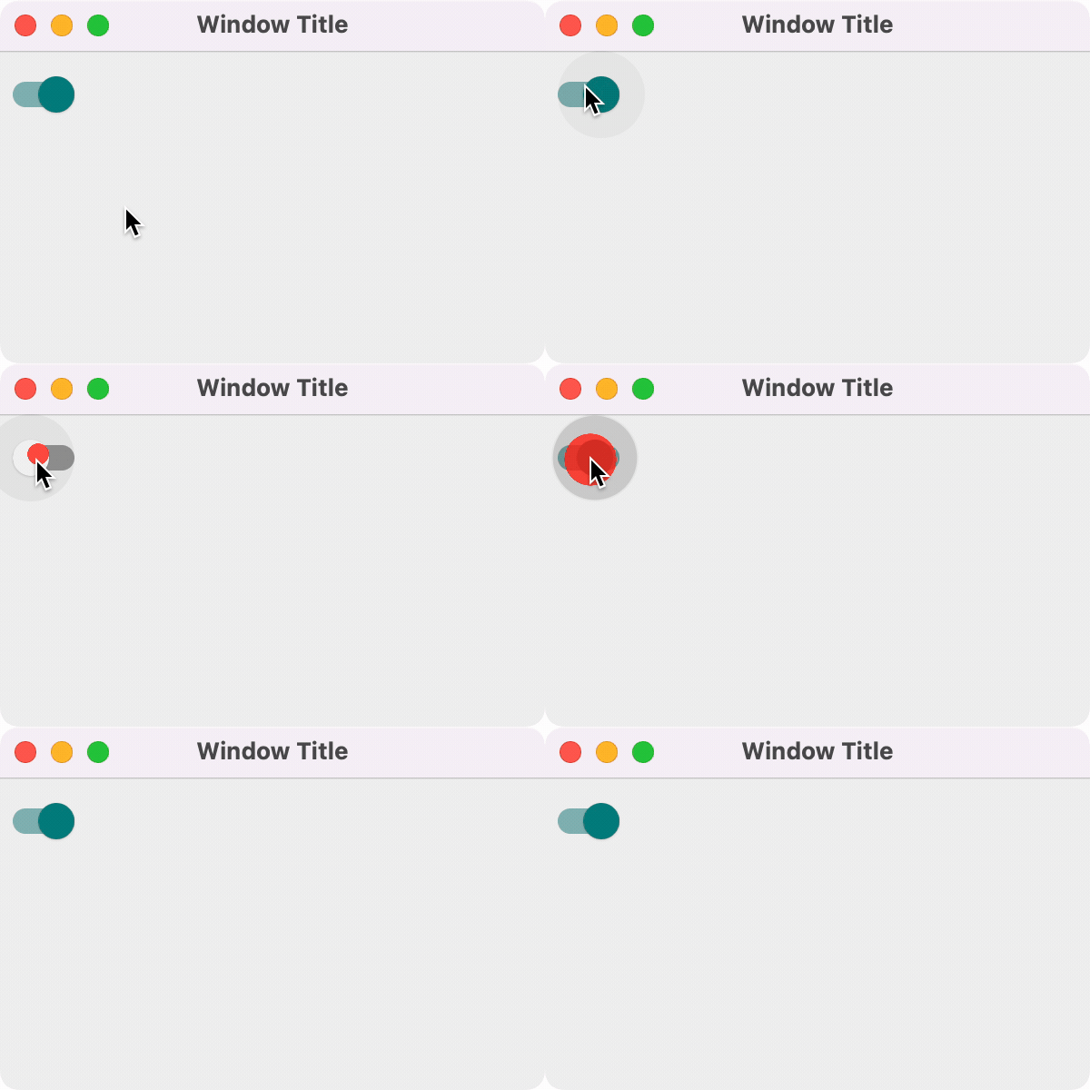
Switch
A Switch is a toggle control similar to a checkbox, in that it represents a boolean state.
@Composable
fun SwitchMinimalExample() {
    var checked by remember { mutableStateOf(true) }

    Switch(
        checked = checked,
        onCheckedChange = {
            checked = it
        }
    )
}
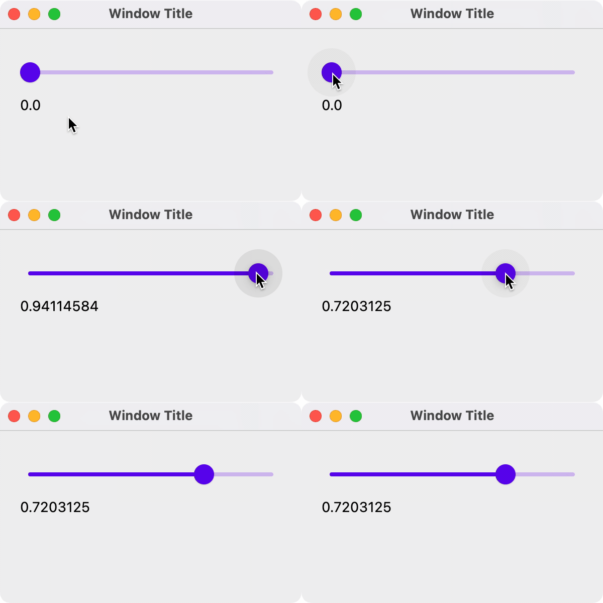
Slider
A slider lets the user make a selection from a continuous range of values. It’s useful for things like adjusting volume or brightness, or choosing from a wide range of values.
Here’s an example from the Slider compose documentation.
@Preview
@Composable
fun SliderMinimalExample() {
    var sliderPosition by remember { mutableFloatStateOf(0f) }
    Column {
        Slider(
            value = sliderPosition,
            onValueChange = { sliderPosition = it }
        )
        Text(text = sliderPosition.toString())
    }
}
Spacer
A spacer just adds empty space. It’s useful when you only want to force space between elements.
@Composable
fun getExtraSpace() {
      Spacer(modifier = Modifier.height(20.dp))
}
Scaffold
A scaffold makes it easy to build an Android-style application, with a top application bar, a bottom application bar, and elements like floating action buttons. Think of it as a pre-defined layout to help you get started with a commonly used structure.
class MainActivity : ComponentActivity() {
    override fun onCreate(savedInstanceState: Bundle?) {
        super.onCreate(savedInstanceState)
        setContent {
            MyApplicationTheme {
                // A surface container using theme 'background' color
                Surface(
                    modifier = Modifier.fillMaxSize(),
                    color = MaterialTheme.colorScheme.background
                ) {
                    ScaffoldExample()
                }
            }
        }
    }
}

@OptIn(ExperimentalMaterial3Api::class)
@Composable
fun ScaffoldExample() {
    var presses by remember { mutableStateOf(0) }

    Scaffold(
        topBar = {
            TopAppBar(title = { Text("Top app bar") })
        },
        bottomBar = {
            BottomAppBar(
                containerColor = MaterialTheme.colorScheme.primaryContainer,
                contentColor = MaterialTheme.colorScheme.primary,
            ) {
                Text(
                    modifier = Modifier.fillMaxWidth(),
                    textAlign = TextAlign.Center,
                    text = "Bottom app bar",
                )
            }
        },
        floatingActionButton = {
            FloatingActionButton(onClick = { presses++ }) {
                Icon(Icons.Default.Add, contentDescription = "Add")
            }
        }
    ) { innerPadding ->
        Column(
            modifier = Modifier.padding(innerPadding),
            verticalArrangement = Arrangement.spacedBy(16.dp),
        ) {
            Text(
                modifier = Modifier.padding(8.dp),
                text =
                """
                    This is an example of a scaffold. It uses the Scaffold composable's parameters to create a screen with a simple top app bar, bottom app bar, and floating action button.

                    It also contains some basic inner content, such as this text.

                    You have pressed the floating action button $presses times.
                """.trimIndent(),
            )
        }
    }
}
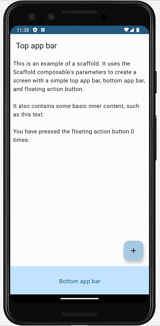
See the App Bar documentation for examples of how to customize top and bottom app bars further.
Other widgets
There are actually two sets of user-interface libraries in Android: the original view-based classes, and the newer Compose classes and functions. Jetpack Compose is relatively new, having been launched in 2017. It is meant to be the main UI toolkit going forward, but that doesn’t mean that the old classes are disappearing! Some of the older android classes are actually used as the foundation for Compose (they share a rendering pipeline for instance).
You can differentiate them based on their package names: android.* are the older classes, and androidx.* are the newer Compose classes.
import android.app.Activity
import android.widget.Toast
import androidx.compose.foundation.layout.Column
import androidx.compose.foundation.layout.Row
import androidx.compose.material3.Button
This is interesting because we can leverage a number of the older classes, that have no corresponding Compose replacement. These work perfectly fine with Compose and let you build some canonical Android behaviour.
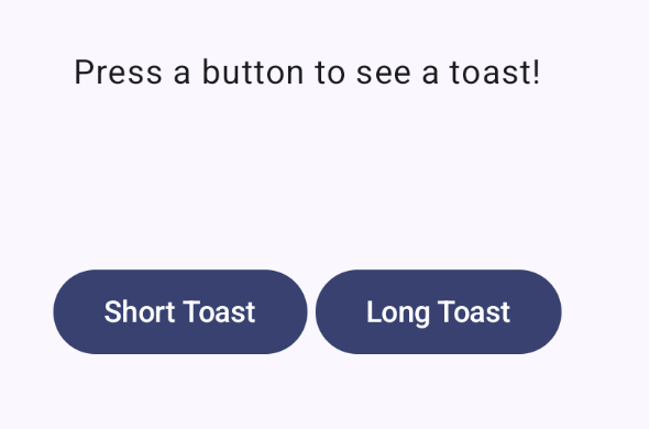
Toast
A toast is a small notification floats above your current content. It can be used where you would normally use a short dialog (where you don’t need user feedback to proceed).
override fun onCreate(savedInstanceState: Bundle?) {
    super.onCreate(savedInstanceState)
    setContent {
        ToastTheme {
            Scaffold { padding ->
                App(activity = this, modifier = Modifier.padding(padding))
            }
        }
    }
}

@Composable
fun App(activity: Activity, modifier: Modifier = Modifier) {
    Column(modifier = modifier.fillMaxSize(), horizontalAlignment = Alignment.CenterHorizontally) {
        Text(modifier = modifier, text = "Press a button to see a toast!")
        Row {
            Button(
                modifier = modifier.padding(2.dp),
                onClick = { Toast.makeText(activity, "This is a short popup!", Toast.LENGTH_SHORT).show() }
            ) {
                Text("Short Toast")
            }
        }
    }
}
Here’s the result UI, and the popup.

Using themes
A theme is a common look-and-feel that is used when building software. Google includes their Material Design theme in Compose, and by default, composables will be drawn using the Material look-and-feel. This includes colors, opacity, shadowing and other visual elements. Apps built using the Material design system have very specific look-and-feel (example below from the Material Getting-Started documentation):
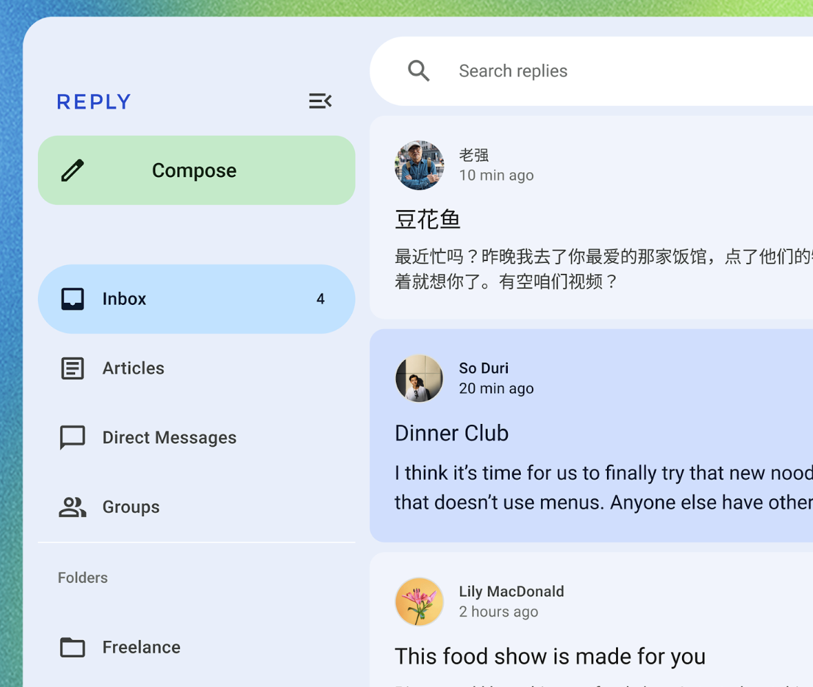
You might want to change the appearance of your application, either for product branding purposes, or to make it appear more “standard” for a specific platform. This can be done quite easily, by either extending and modifying the built-in theme, or replacing it completely.
Customization
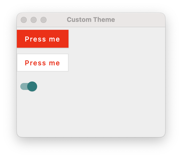
To customize the default theme, we can just extend it and change its properties, and then set our application to use the modified theme. See The Color System for details on how colors are applied to Composables.
fun main() = application {
    Window(
        title = "Hello Window",
        onCloseRequest = ::exitApplication,
        state = WindowState(width=300.dp, height=250.dp, position = WindowPosition(50.dp, 50.dp))
    ) {
        CustomTheme {
            Column {
                // primary color
                val buttonText = remember { mutableStateOf("Press me") }
                Button(onClick = { buttonText.value = "Pressed!" }) {
                    Text(buttonText.value)
                }
                val outlinedButtonText = remember { mutableStateOf("Press me") }
                OutlinedButton(onClick = { outlinedButtonText.value = "Pressed!" }) {
                    Text(outlinedButtonText.value)
                }

                // secondary color
                var switchState = remember { mutableStateOf(false) }
                Switch(switchState.value, onCheckedChange = { switchState.value = !switchState.value })
            }
        }
    }
}

@Composable
fun CustomTheme(
    content: @Composable () -> Unit
) {
    MaterialTheme(
        // change main colors
        colors = MaterialTheme.colors.copy(
            primary = Color.Red,
            secondary = Color.Magenta,

        ),
        // square off corner of components
        shapes = MaterialTheme.shapes.copy(
            small = AbsoluteCutCornerShape(0.dp),
            medium = AbsoluteCutCornerShape(0.dp),
            large = AbsoluteCutCornerShape(0.dp)
        )
    ) {
        content()
    }
}
Third-party themes
There are third-party themes that you can include to replace the Material theme completely:
- Aurora library allows you to style Compose applications using the Ephemeral design theme.
- JetBrains Jewel changes the look-and-feel to match IntelliJ applications. e.g. IntelliJ IDEA.
- MacOS theme mimics the standard macOS-look-and-feel.
Importing from Figma
If you use Figma to build prototype user-interfaces, you can export the Compose code from Figma into your Composables directly!
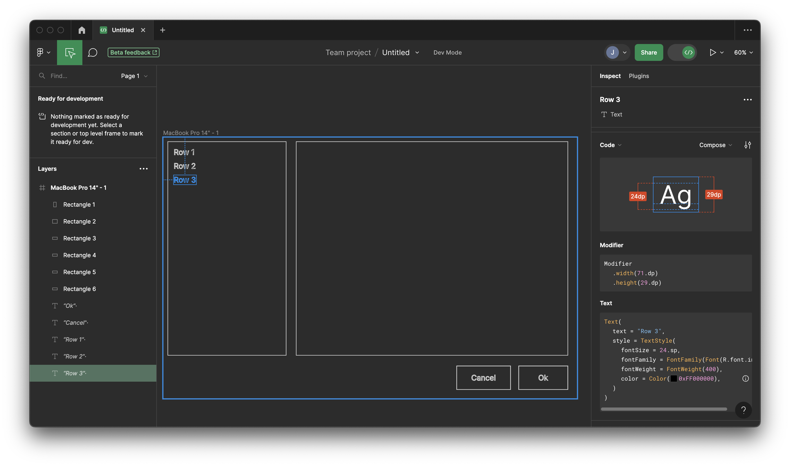
In this example, we have a Text field selected. Click on Dev mode on the right-hand toolbar, and you can see the Compose code displayed.
Text(
  text = "Row 3",
  style = TextStyle(
    fontSize = 24.sp,
    fontFamily = FontFamily(Font(R.font.inter)),
    fontWeight = FontWeight(400),
    color = Color(0xFF000000),
  )
)

This makes it relatively easy to export your properties from your mockups and use them directly in your Compose theme!
-
Diagrams from Dea et al. JavaFX By Example. 2017. ↩
-
Note that this is the resolution that the screen is set to display, which may be different from the resolution that the screen natively supports. For example, my monitor is meant to run at 2880x1440, but I can set it to any desired resolution up to those values. ↩